Duffle Admin- Enhancing critical parts of the admin experience to support smoother management

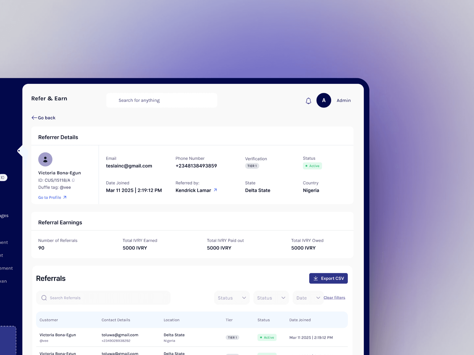
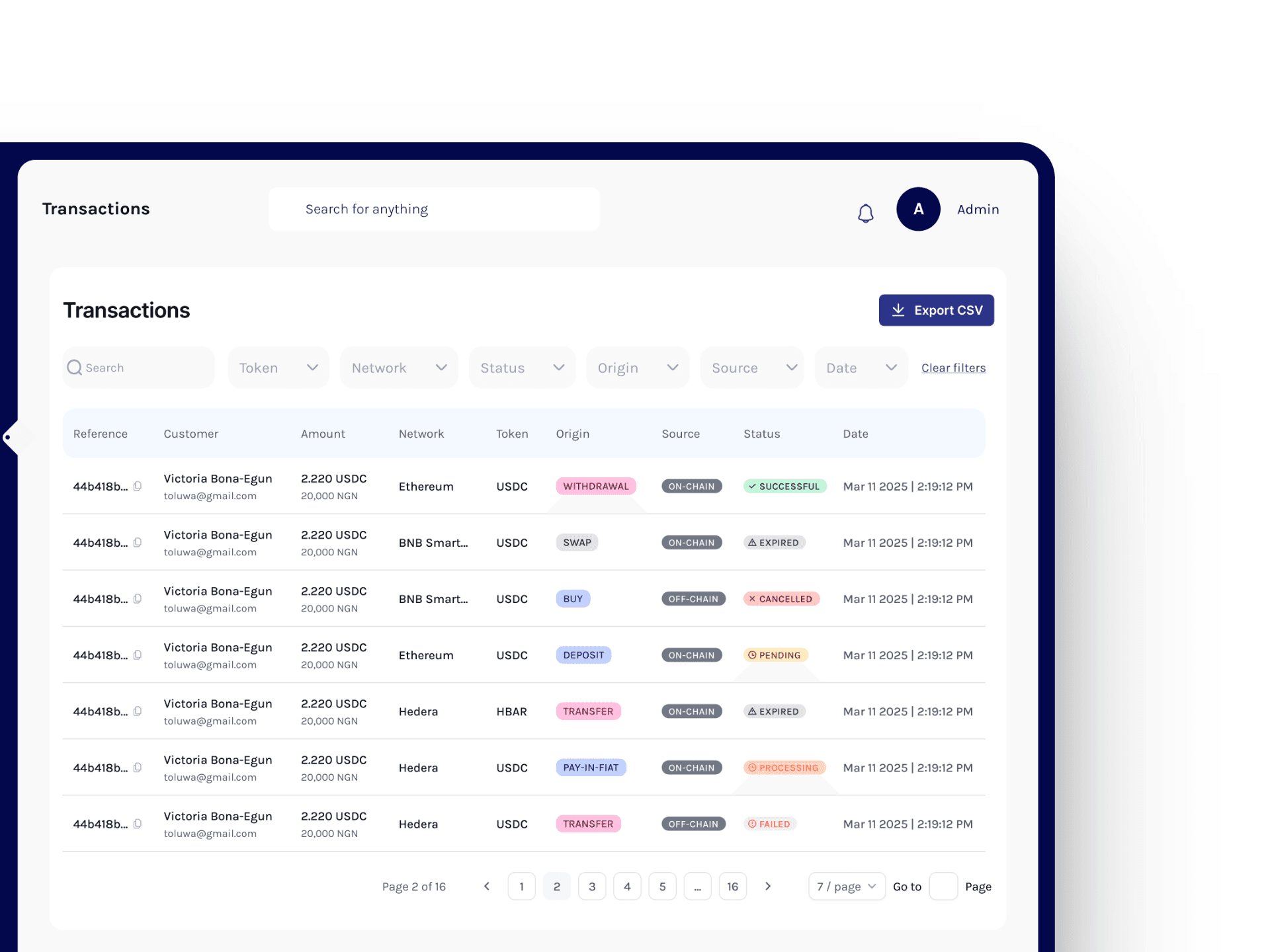
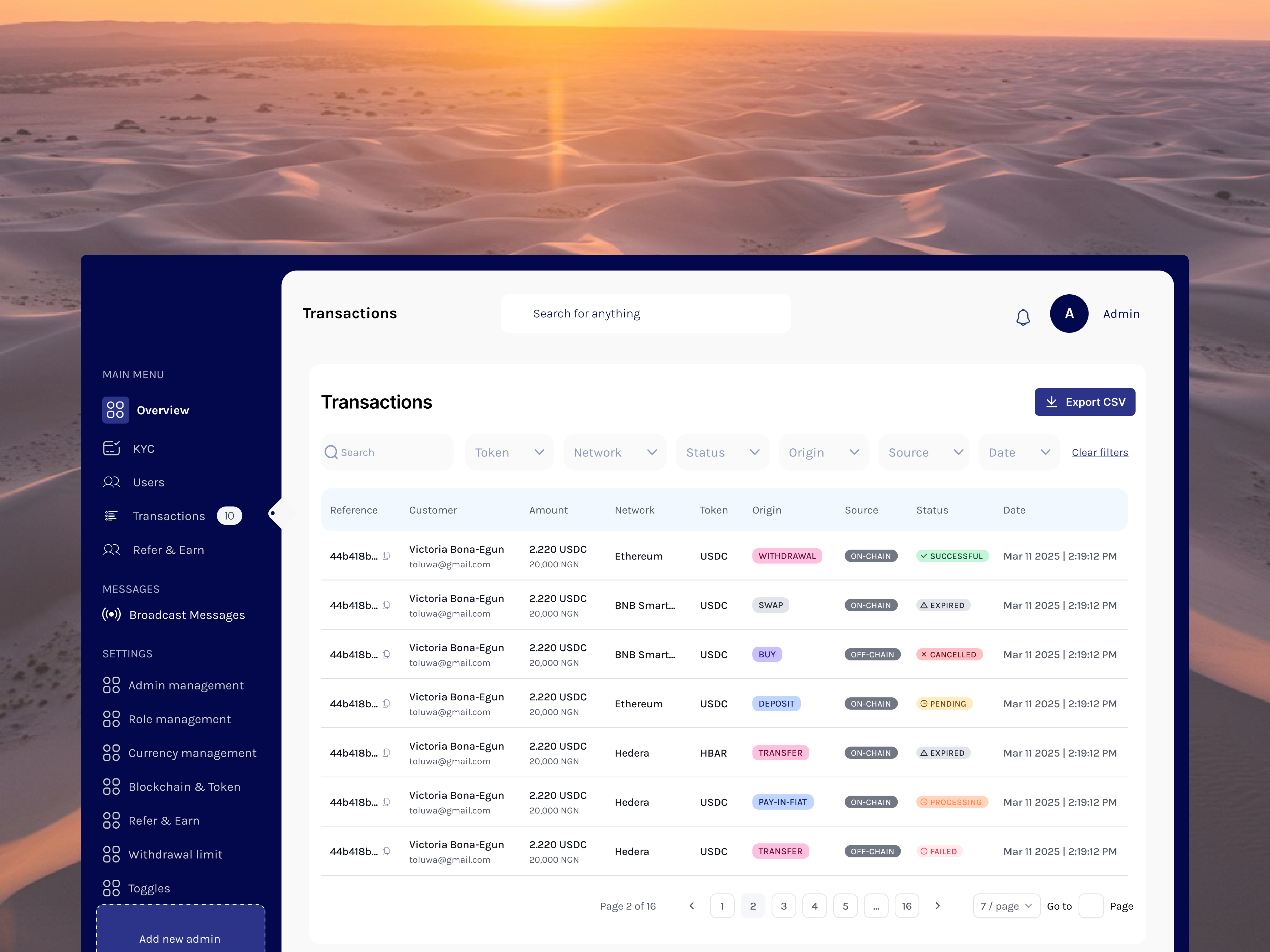
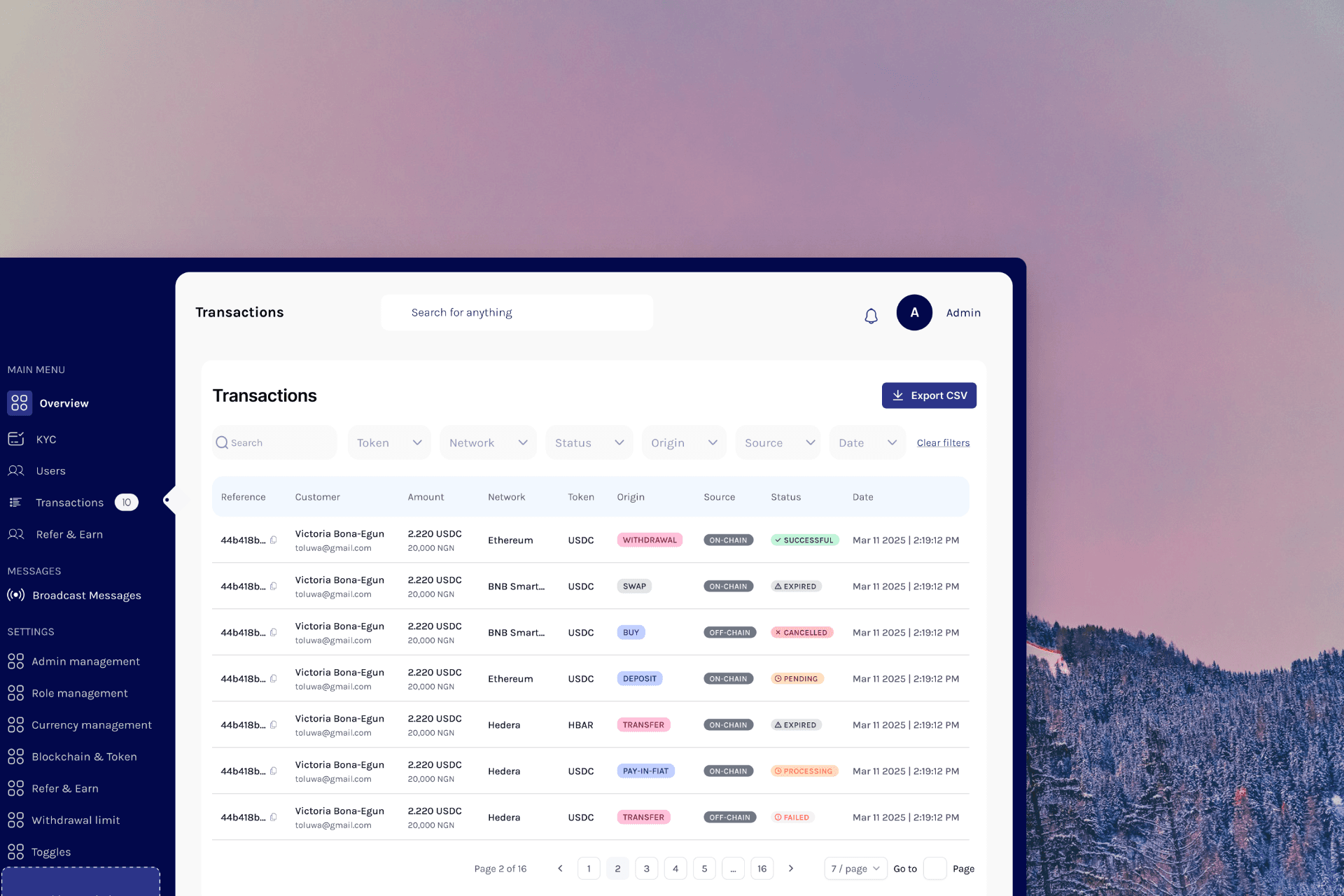
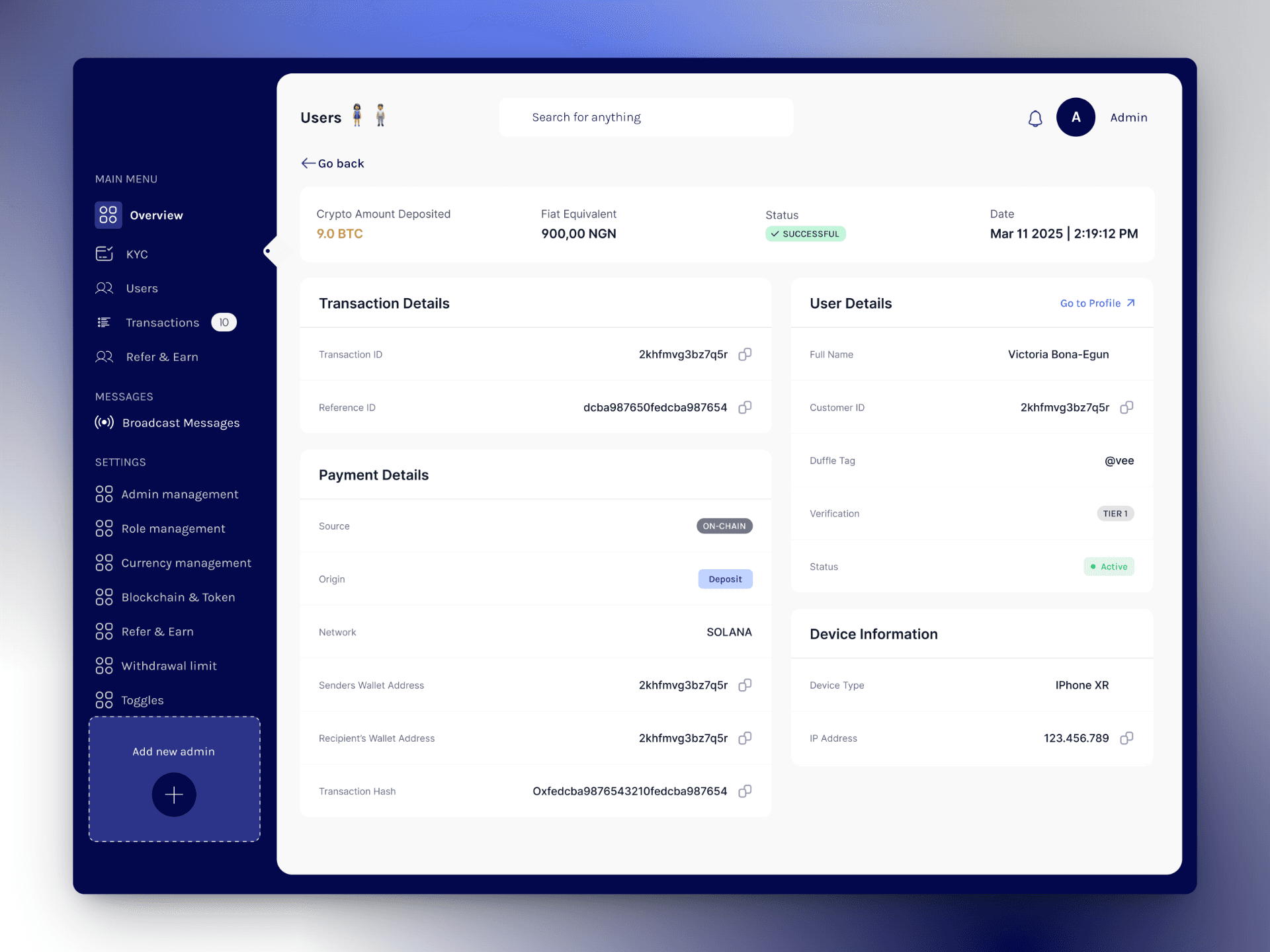
Duffle’s internal admin system lacked essential tools for monitoring, analysing, and managing the transactions the consumer app was facilitating. Through research with end users, I led the UI/UX overhaul to address data visibility gaps, improve data findings, and offer real-time insights into platform revenue and user activity.

COMPANY

Ivorypay

YEAR

2025

DURATION

3 weeks

INDUSTRY

WEB 3

FINANCE

WEB APP

INTERNAL TOOL

RESPONSIBILITIES

UI/UX Design, Wireframe, Research, UX Audit, Product Management

THE PROBLEM

Designed Early. Stretched Thin

The admin system wasn’t broken, but it wasn’t helpful either. Built early on, it struggled to support the team’s needs once the product launched and began to scale. Important data was hidden, workflows were clunky, and teams had to rely on engineers for answers they should have seen at a glance.

Incomplete Transaction: Records Key details like wallet addresses, timestamps, and token networks were missing.

Incomplete Transaction: Records Key details like wallet addresses and networks were missing.

Incomplete Transaction: Records Key details like wallet addresses, timestamps, and token networks were missing.

Poor Data Navigation: The dashboard only allowed date-based filtering, limiting data drill-down.

Poor Data Navigation: The dashboard only allowed date-based filtering, limiting data drill-down.

Limited User Oversight: Admins couldn’t view referrals, user activity, or onboarding details.

Limited User Oversight: Admins couldn’t view referrals, user activity, or onboarding details.

Lack of Revenue Insight: There was no way to monitor platform earnings from user transactions.

Lack of Revenue Insight: There was no way to monitor platform earnings from user transactions.

RESEARCH

Designing with the Users

With a tight-knit team close and accessible, I set up 1:1 calls with 4 stakeholders to understand how they used the dashboard day-to-day. Their input surfaced real pain points and helped shape a redesign grounded in the realities of their workflow.

“When I look at a table, I want to see relevant information. I shouldn’t have to click on it first. There’s no point in the table being clean if I can’t find what I need.”

“When I look at a table, I want to see relevant information. I shouldn’t have to click on it first. There’s no point in the table being clean if I can’t find what I need.”

Mr. A, (Operations)

“I want to be able to see the high transaction amounts so I can investigate for compliance. Manually scrolling is tiring”

“I want to be able to see the high transaction amounts so I can investigate for compliance. Manually scrolling is tiring”

Mr. B, (Compliance)

“I don’t want to have to manually start calculating what we’ve made in revenue or have to ask the backend for it”

“I don’t want to have to manually start calculating what we’ve made in revenue or have to ask the backend for it”

Mr. C, (Finance)

"I want to be able to see if a user was referred by someone”

"I want to be able to see if a user was referred by someone”

Mr. D, (Customer Support)

THE PROBLEM

Designing with the Users

Every one of these pain points informed a decision. These weren't just nice-to-haves—they were non-negotiables for the people trying to run the business effectively. Here’s How: